This report summarises the research activities and findings from the TLRI-funded project entitled Visualising Chance: Learning Probability Through Modelling. This exploratory study was a 2-year collaboration among two researchers, two conceptual software developers/interactive graphics experts, three university lecturers/ practitioners, one master’s student, four teacher observers and one quality assurance advisor. The project team designed innovative software tools and associated tasks which aimed to expose introductory students to a modelling approach to probability. The study sought to discover what conceptual understanding of probability and what probabilistic reasoning could be promoted from such an approach.
Key findings
- The ability to see structure in, and apply structure to, a problem situation is an important aspect of probability modelling and this ability is founded on the key concepts of randomness, conditioning, distribution, and mathematics.
- The four dynamic visualisations and tasks, designed to expose students to a modelling approach to probability, have the potential to deepen and enhance students’ probabilistic reasoning.
- Engagement, an important component for the learning of probability, may be promoted by providing relatable contexts and by incentivising students to make conjectures prior to interacting with technological tools.
- Flexible use of representations, essential for developing probabilistic thinking, may be supported through the experiencing and linking of a variety of chance-generating mechanisms.
Major implications of these findings
- Seeing structure within problem situations draws upon a diverse range of learning experiences in multiple contexts and requires teaching strategies that deliberately enhance transferability to new situations.
- New learning trajectories incorporating dynamic visualisations require careful development to support students as they experience simple through to more complex representations.
- From a pedagogical perspective, encouraging students to make conjectures which they then test and analyse through the use of technological tools requires careful consideration about how to scaffold students’ thinking and how to draw their attention to salient features.
Background to research
Random events and chance phenomena permeate our lives and environments. Considering the number of different disciplines that require the application of probabilistic concepts and understanding of probabilistic reasoning, the learning of probability is essential to prepare students for everyday life. However, the current approach to teaching probability draws on the tradition of classical mathematical probability, resulting in a formal approach which may not be accompanied by a substantial understanding of the chance phenomena that the mathematics describes (Moore, 1997). Such an approach renders many probability ideas inaccessible to most students (Chernoff & Sriraman, 2014; Greer & Mukhopadhyay, 2005). Numerous education researchers and statisticians (e.g., Chaput, Girard, & Henry, 2011; Greer & Mukhopadhyay, 2005; Konold & Kazak, 2008) have emphasised that probability is about modelling real world systems in order to understand and make predictions about that system. Also, probability modelling using simulations is the practice of applied probabilists, which further amplifies the disconnect between education and actual practice (Pfannkuch & Ziedins, 2014). Hence there is a general consensus that students should experience both theoretical and data modelling approaches to probability.
Access to technology has created an opportunity for students to: experience random behaviour through simulations; create probability models and to test, with data, the adequacy of the models for mimicking realworld systems; visualise chance through the creation of new representational infrastructure; and gain access to concepts that were previously inaccessible (Sacristan et al., 2010). Furthermore, according to Shaughnessy (2007, p. 995), “technological tools are very important for helping students to transition from those naïve conceptions to richer more powerful understanding of statistical concepts”.
Technology, and the visual imagery offered, however, is not sufficient for conceptual growth. Also important is the teacher’s and students’ articulation of how they make sense of, and explain in their own words, what they see and understand and thereby create meaning from the images (Makar & Confrey, 2005). Such sense-making reflection between teacher and students is paramount in developing conceptual reasoning (Bakker, 2004).
Methodology
The methodology employed in this study is action research. Such an approach reduces the perceived gap between research and practice by having practitioners identify problematic areas and work together with researchers such that the results are of direct use within their educational setting. As noted by Burns (2000, p. 443), action research is “a total process in which a ‘problem situation’ is diagnosed, remedial action planned and implemented, and its effects monitored if improvements are to get underway”; thus it seemed particularly fitting for the current study. The action research process comprised five phases. In the first phase, the essential conceptual ideas required for probabilistic thinking, and the problematic areas for students, were identified in three ways: by interviewing seven people who use stochastic modelling and probability in their professions; by having collaborative meetings between the researchers, practitioners, and software conceptual developers in the research team; and by conducting a review of the literature. The second phase involved a qualitative thematic analysis of the interviews (Braun & Clarke, 2006), project team deliberations, and a literature review to identify the main problem areas and conceptual ideas that needed addressing. In the third phase, the project team identified four significant areas for development of probabilistic reasoning for which tasks and software tools could be developed. For each area, a conceptual analysis of the underpinning concepts and possible conceptual pathways was undertaken. Considerable time was invested in devising tasks that would develop students’ probabilistic reasoning and incorporate learning probability through using a modelling perspective, visual representations, and theory. The fourth phase involved piloting each of the four software tools and associated tasks with three pairs of students who had already completed an introductory probability course. In the fifth phase, a retrospective analysis was carried out, followed by modification to the tools and tasks.
Given the exploratory nature of the study, there are analogies to a pre-clinical trial in which one investigates, experiments, and modifies a proposed intervention within a laboratory setting prior to implementation in humans (Schoenfeld, 2007). In this study, our interactions with the participating students can be considered laboratory work, with the aim of refining the tools and tasks based on our findings in order to implement in classroom-based settings in the future.
The research was conducted over 2 years. At the start of the first year, the interviews with the seven people who used stochastic modelling and probability in their professions were carried out. These practitioners were involved in a diverse range of fields (e.g., ecology, queueing and networks, hydroelectricity, operations management, agriculture, commerce, and the development of probability theory). Two prototype software tools and associated tasks were also developed during the first year, with another two tools and tasks being developed in the second year. Over the 2-year period, each of the four tools and tasks were trialled on three pairs of students. The main data collected were interviews with the seven practitioners, and pre-assessments, task interviews, and reflection interviews with all of the participating students.
The student participants in this study were in their first year at university (ages 18–19) and had completed an introductory probability course. Because of our university’s ethical requirements, whereby it was determined that students participating in our study could be perceived as having a potential grade advantage over other students, we could not recruit them before or during the course. Hence the student participants in our study could be presumed to have acquired a working knowledge of joint and conditional probability distributions, the Poisson process, and Markov processes from a mathematical perspective.
Analysis
An inductive thematic qualitative analysis was conducted on the practitioner interviews (Braun & Clark, 2006). Two research team members deliberated through a series of meetings to reach consensus on the themes that emerged from the interviews. Another team member undertook an independent thematic analysis on the transcribed interview data with the assistance of the software package NVivo, version 10 (2012). Further analysis and modification continued after the interviewees read, commented on, and reacted to a draft manuscript which described the process (Pfannkuch et al., in press).
The students’ interactions with two of the tasks and tools were qualitatively analysed against appropriate theoretical frameworks to identify salient features of the students’ understanding that seemed to emerge during the study. The other two tasks have been partially analysed and thus preliminary findings are presented.
Results
The research question was:
What conceptual understanding of probability and what probabilistic reasoning is promoted when introductory university students are exposed to a modelling approach to probability and to learning strategies focused on dynamic and static visual imagery and language?
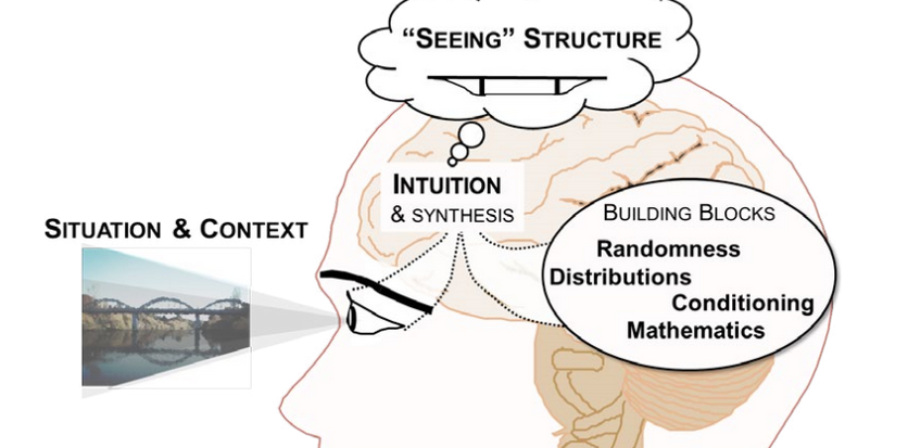
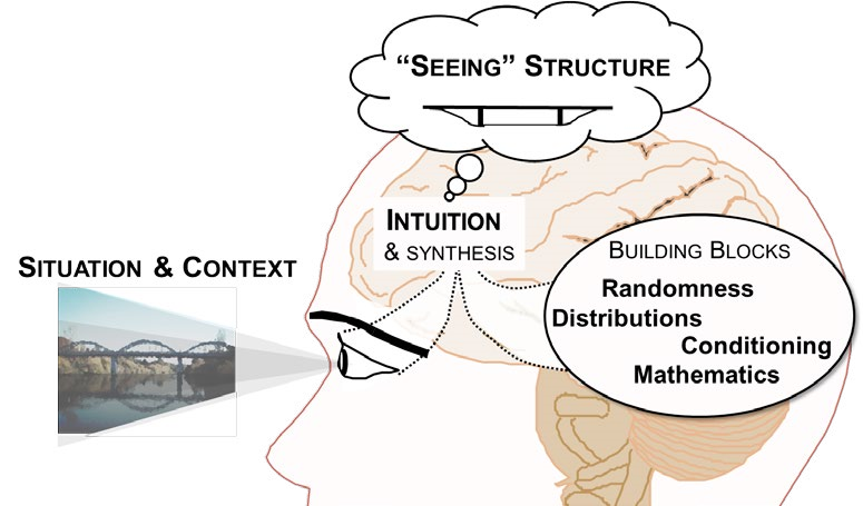
To answer this question, we first established the essential conceptual ideas required for probabilistic thinking from a qualitative analysis of interviews with seven people who used stochastic modelling and probability in their professions. From the interviews it emerged that underlying the practice of probability modelling are fundamental notions of seeing structure and applying structure (Pfannkuch et al., in press). Seeing particular types of structure within a problem context is based on the development of an intuition or perspective of seeing the world through the lens of probability. Essential to the development of this intuition, which emerged from the interviews as necessary for probability thinking and modelling (see Figure 1), are four main interconnected building blocks: randomness, distribution, conditioning, and mathematics.
Since most of the interviewees were also teachers of probability, we asked them about problem areas that their students encountered when learning about probability. Using a thematic analysis method we identified the following main perceived problem areas for their students: the disposition or the willingness to engage, persevere, and understand probability; the idea of distribution; the ability to move between and within representations including the representation of the problem in words; mathematics; and randomness and decisions. In addition to the specific problematic areas mentioned by the practitioner interviewees, we also conducted a review of the probability education literature which documents many misconceptions in peoples’ thinking (Kahneman, 2011; Nickerson, 2004). In particular, Bayesian-type problems presented difficulties for many, with the base rate fallacy and the confusion of the inverse misconception dominating people’s reasoning (Koehler, 1996; Villejoubert & Mandel, 2002). Watson and Callingham (2014) noted that students have difficulty in employing proportional reasoning when interpreting frequency tables.
In terms of possible strategies to enhance student understanding of probability, some of the main themes that emerged from the interviews were to: incentivise students to engage; use visual imagery; allow students to play around with chance-generating mechanisms; develop strategies to enable students to link across representations; and use contexts that students can relate to. With regard to the misconceptions noted within the probability education literature, much effort has been directed into researching the pedagogical issues underlying Bayesian-type problems, with approaches such as presenting probability information in frequency tables rather than in probability format (Gigerenzer & Hoffrage, 1995; Gigerenzer, 2014), and by providing accompanying visual representations (Garcia-Retamero & Hoffrage, 2013; Navarette, Correia, & Froimovitch, 2014). Furthermore, Watson and Callingham (2014) suggested that a simple visual structure may be beneficial for students and that prompting students to consider relationships between the numbers in frequency tables might enhance their proportional reasoning, an important underlying concept for probability.
The problem areas and misconceptions identified by the interviews and documented in the literature, in conjunction with the strategies proposed, informed the design of four tools and their associated tasks. A prominent feature of each task was allowing students to make and test conjectures which has been suggested as a method for motivating students to engage (Garfield, delMas, & Zieffler, 2012). We developed a six-principle framework to guide the development of the tools and tasks. The principles were to encourage students to:
- make conjectures
- test their conjectures against simulated data
- link representations
- perceive dynamic visual imageryrelate to contexts
- interact with chance-generating mechanisms.
The next sections discuss the four tools and their associated tasks.
The eikosogram tool and associated task
The eikosogram—a word constructed from the Greek words eikos, meaning probability, and gramma, meaning drawing or picture—first appeared in the work of Oldford and Cherry (2006) who argued persuasively that eikosogram diagrams facilitated the study of probability. Noting the research findings concerning Bayesiantype problems and frequency table interpretation, we developed an eikosogram-type visualisation which was aimed at enhancing students’ proportional reasoning when developing conditioning concepts. The associated task involved two variables, eye colour and gender, and was based on a question posed in the work of Froelich and Stephenson (2013). The task and two eikosogram representations of the data are shown in Figure 2. Representation (a) has eye colour on the horizontal axis while representation (b) has gender on the horizontal axis (http://4ddsyv3x.docker.stat.auckland.ac.nz/).
Figure 2. Task introduction and two eikosogram representations of the eye colour and gender data
| Pre-task questions
a. Do you think that an individual’s eye colour depends on whether that individual is male or female? Brown, Blue, Hazel, Green, Other
Repeat part (iii) under the assumption that eye colour and gender are dependent. |
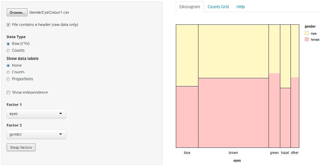
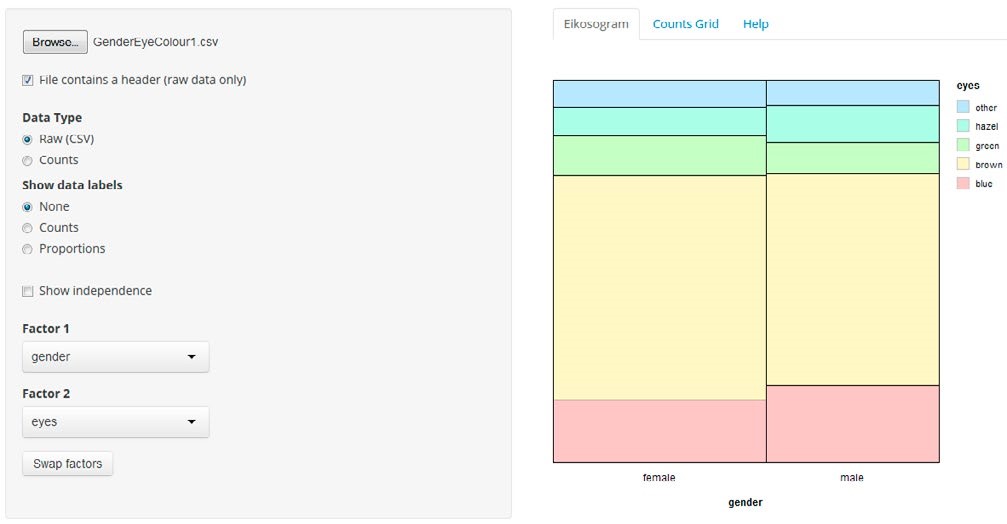
The rationale for the task introduction was to have the students make conjectures based on their intuition and contextual knowledge which required them to understand the situation presented and to engage with the problem. Furthermore, the questions posed in the task introduction served to incentivise the students to test their conjectures against the data and to reflect on their representations compared to the eikosogram representation. The eikosogram provides a visual representation of a two-way table of information. Figure 2 illustrates the non-numeric format of the eikosogram, but there is the option of adding counts and/ or proportions. When the Show independence checkbox is ticked, the resulting representation depicts the eikosogram under the condition that eye colour and gender are independent. The task and tool together address some of the identified problematic areas and incorporate several of the strategies suggested by the interviewees.
The theoretical framework used for analysing the student data was informed by research in the domain of graphicacy (Friel, Curcio, & Bright, 2001) and includes additional components relating to versatile thinking (Thomas, 2008), the effect of context (Watson & Callingham, 2014), and the integration of contextual and statistical knowledge (Wild & Pfannkuch, 1999). See Pfannkuch and Budgett (in press–b) for more detail on the theoretical framework.
Although the students had prior experience of interpreting two-way tables, they struggled initially with the unfamiliar eikosogram representation. They needed time to decode the horizontal and vertical dimensions in the context of the problem. While this decoding led to extracting information and verbalising simple probability statements, all students required prompting in order to find relationships, provide fuller language verbalisations, and to explicitly determine the conditioning event when forming conditional statements. However, having invested both time and effort in their first interaction with the eikosogram, when they swapped factors and interpreted the eikosogram from a different perspective, they were able to integrate what they had previously learned and voluntarily remarked on the relationship between proportions and counts. This relationship seemed to be a revelation to the students since they returned to this idea several times, including when the counts and proportions were put on the eikosogram. An example is given in the following excerpt between two students, Leo and Martin.
| Leo: | You can see that the female box looks slightly wider than the male box cause I’m assuming more females responded to the survey. |
| Martin: | Yeah. |
| Leo: | But you can see that the proportion of males with blue eyes is higher than the proportion of females with blue eyes because it’s higher that way. |
| Martin: | But then that’s sort of what I was getting at because it does look higher if you are just looking at it this way, it looks bigger, but then when you factor in the width as well you are not, at least yeah I would say it’s bigger but I am not sure. |
| Leo: | The proportion is bigger. The total number might not be bigger but the proportion is definitely higher because you can see the bar is just higher. |
| Interviewer: | So when you are saying the proportion, the proportion of what? |
| Leo: | The proportion of blue, yeah blue-eyed males is higher than the proportion of blue-eyed females. |
| Martin: | But it doesn’t necessarily mean that there’re more blue-eyed males than blue-eyed females. |
Hugo and Helen had a similar conversation:
| Hugo: | More males than females have blue eyes. |
| Helen: | No, not necessarily. I think the areas are equal but that is higher because this is a less wide one. |
| Hugo: | Right so you would have to do the conditional to say that. So the probability somebody has blue eyes given that they are male is higher than the probability that somebody has blue eyes given that they are female… [after struggling with the idea] … if the areas are the same and you pick a random point you are just as likely to be in that box as that box. But as soon as you condition… it wouldn’t be equal. |
When the students were asked to explore relationships between other categorical variables that were available to them, they were able to integrate all of the information they had gleaned from interpreting the eikosogram. They readily verbalised conditional statements, considered independence in connection with conditional statements, and justified their perception of independence from both a contextual perspective and a statistical perspective.
Student reflections indicated that the visualisation of two-way table information, including the swapping of factors facility, was helpful. They mentioned that it was useful to start with a non-numeric eikosogram since they believed that representing proportions as areas gave them a better intuitive sense of the weightings and influences of each possible outcome.
The conventional representation for displaying the relationship between two categorical variables is numerically as proportions or frequencies in a two-way table. For learning purposes, however, introducing students first to the non-numeric visual eikosogram may be beneficial to promote students’ proportional reasoning, to enhance their appreciation of the relationship between and among the data cells and to learn how to tell stories about the information contained therein.
The Markov tool and associated tasks
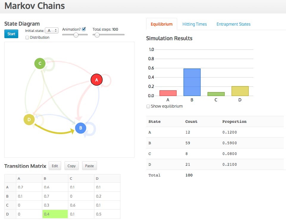
The Markov chains tool (https://www.stat.auckland.ac.nz/~wild/MarkovChains/markov.html#) was based on a dynamic visualisation developed by Victor Powell on the Setosa blog (see: http://setosa.io/blog/2014/07/26/ markov-chains/). The first two associated tasks involved a car rental agency context while a third task involved a cut-down version of a Snakes and Ladders game. The tasks (see Appendix 1) provided relatable contexts, built on students’ prior knowledge, and required them to make conjectures about the equilibrium and hitting times distributions before they interacted with the tool to test their conjectures.
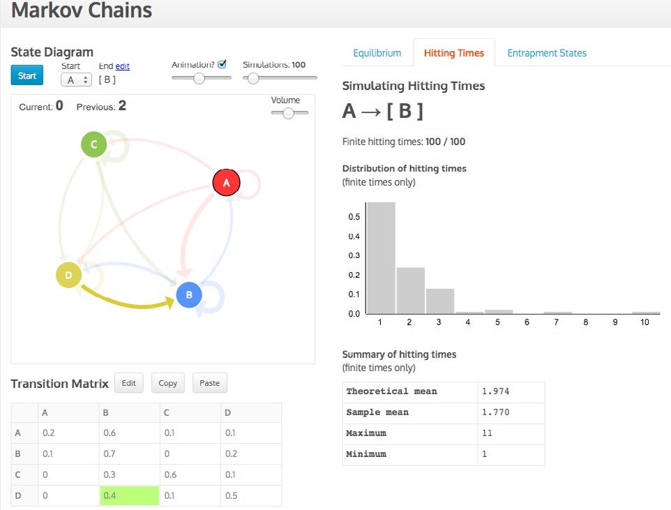
Data are entered in the transition matrix and then a state diagram, with arrows proportional to their probabilities appears, which can be repositioned in its designated space (see Figures 3 and 4). The simulation can start in any state and, in the case of determining the hitting times, can end in any state. As the simulation progresses, the three representations (state diagram, transition matrix, distribution) are active and linked while the distribution gradually builds up. For example, in Figure 3 the transition from D to B is simultaneously highlighted in the matrix and diagram. The animation can be sped up or turned off and up to 1,000 simulations can be conducted. For the hitting times distribution a sound feature was added to denote a hit on the end state, which simultaneously visually enlarges. Current and previous hitting times are also recorded (see Figure 4).
The Markov tasks required the students to first make conjectures based on their intuition and contextual knowledge. As for the eikosogram, the Markov tasks and tool together address some of the identified problematic areas and incorporate several of the strategies suggested by the interviewees.
The theoretical framework supporting the Markov tasks and tool and used for analysing the student responses was the six-principle framework outlined earlier in this report. The six principles were based on literature derived from a number of different sources. For example, the principle linking representations was based upon the versatile thinking framework proposed by Thomas (2008). Thomas’ assertion that using and thinking with representations plays an essential role in the development of mathematical (or probability) thinking, together with his observation that the flexible use of representations assists students to develop rich schema and conceptual understanding, are significant when considering how students might interact with the Markov tool and tasks. Furthermore, Graham, Pfannkuch, and Thomas (2009) demonstrated how the development of concepts in statistics could arise using technology-linked representations, while Pfannkuch, Budgett, and Thomas (2014) provided indirect evidence that technology designed for learning inferential concepts through linking representations seemed to promote concept formation. Further detail on the six-principle theoretical framework is provided in Pfannkuch and Budgett (in press–a).
Using their prior knowledge, all of the students were able to draw the state diagram and put it into matrix format for the scenarios described in the tasks. All but one of the students were able to explain how the dynamic representations of the transition matrix and state diagram in the tool related to the context of the problems, and how the Snakes and Ladders game, which they physically played with a board and a die, was related to the matrix. An example of one pair of students’ exploration of the tool involves Mark and Cameron, who were asked in the context of four rental car offices (see Appendix 1 and Figure 3) to rank intuitively the probabilities for the equilibrium distribution from highest to lowest. Mark suggested B would have the highest probability because it is the “one with the biggest probability coming in.” They looked at the matrix (Figure 3) and came up with the idea of summing the probabilities in the column to rank the equilibrium distribution probabilities. Cameron: “I think it is the sum. Cause for this like [refers to Column B, see Figure 3] you add like, even if you do the equilibrium you add them up [we believe he is referring to how the equilibrium distribution is calculated], right you add them up.” Using this conjecture, they rank the probabilities as B > D > C > A. They then watched the simulation to test their conjecture, with the following discourse:
| Mark: | Oh no! |
| Cameron: | A is actually bigger than C. [They realise it is a simulation and check the theoretical values.] |
| Mark: | So you were right. So you can just sum down it (the columns) effectively. |
| Cameron: | It may not be that accurate but it should be around (that)… |
| Mark: | Don’t know if it (the conjecture) is true. Might be … And the reason I say that it is [true], because these are the probabilities coming in [to each state] and the probabilities coming in should be directly related to the equilibrium distribution, if there is one. |
The interaction between Mark and Cameron in the above excerpt is an illustration of how all the students operated throughout all three Markov tasks: make a conjecture, do the simulation, test the conjecture against the simulation, analyse why the conjecture is correct or incorrect. From these students’ interactions with the equilibrium distribution we note they were engaged, and reasoning at quite a deep level from the numerical matrix representation to conjecture how it could be linked to the distribution representation. In doing this, the students not only engaged with probabilistic ideas and reasoning, but persevered in trying to grasp how the Markov process worked.
Post-task reflections indicated that the students valued the dynamic visual imagery offered by the tool. Their comments suggested that the mathematical approach, with its dense notation, can be confusing. They also mentioned that using their intuition, in the form of making a conjecture, was useful since they thought this type of reasoning was important to see if an answer was sensible.
Markov processes are traditionally taught from a mathematical perspective. We believe that accompanying dynamic visualisations and tasks which engage students in making and testing conjectures may promote deeper probabilistic reasoning.
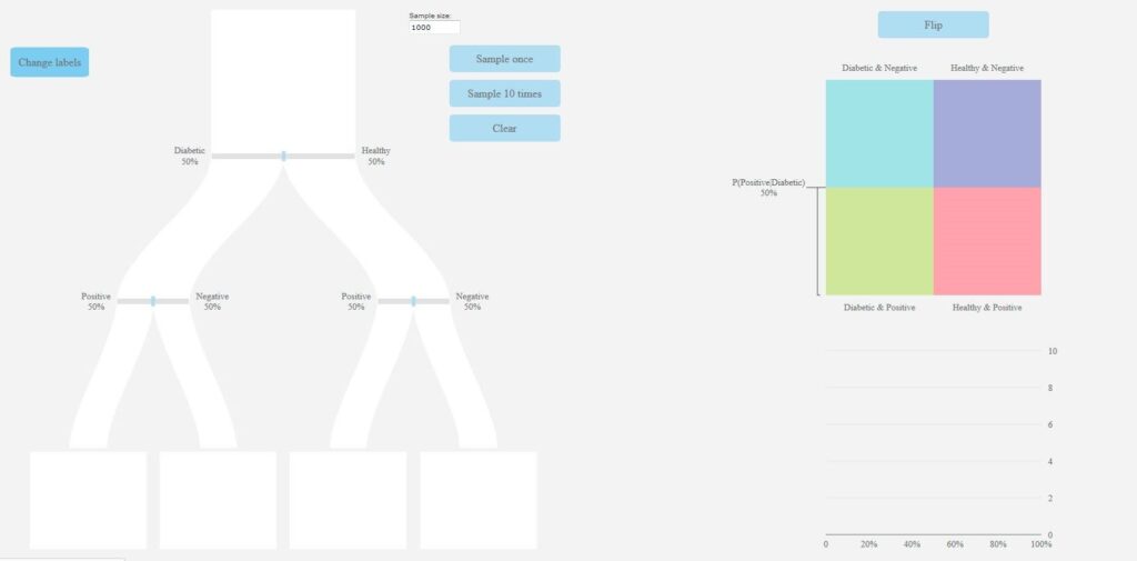
The pachinkogram and associated task
The pachinkogram (see: https://www.stat.auckland.ac.nz/~vt/) is a visual representation of the traditional probability tree. However, the branches of the pachinkogram are proportional in size to their respective probabilities (see Figure 5). The task accompanying the pachinkogram (see Appendix 2), based on a contextually relatable medical screening situation and similar to those commonly found in the literature (e.g., Gigerenzer, 2002), was designed to address the base rate fallacy and the confusion of the inverse misconception.
Probabilities on the pachinkogram branches can be changed by sliding the bars on the branches, and the user is able to decide on a sample size for their simulation. For each simulation, dots corresponding to each member of the sample flow down the pachinkogram branches dynamically and end up in the “buckets” at the bottom (see Figure 5(b) for a screenshot captured towards the end of one simulation). An eikosogram sits alongside the pachinkogram which can be manipulated (as in the swap factors facility of the eikosogram tool) to consider and interpret probabilities with inverted conditions.
Representation (a)
Representation (b)
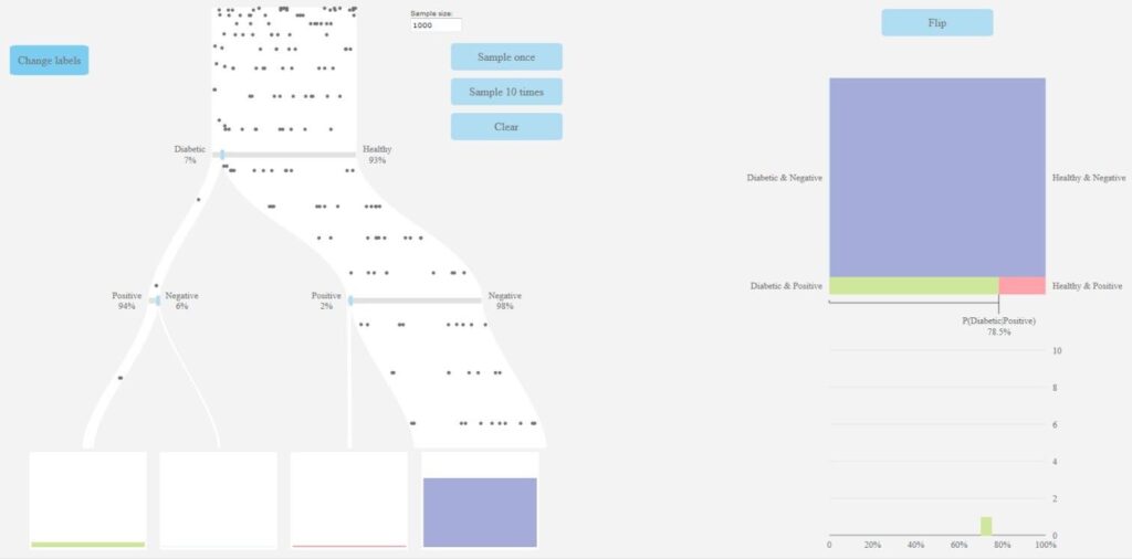
The pachinkogram task again sought students’ conjectures about the approximate values or ranges of probabilities, and the impact of alterations to the probabilities associated with the branches of the pachinkogram. The pachinkogram tool links the dynamic, proportional probability tree on the left-hand side of the display to the eikosogram and graph at the right-hand side of the display. As before, the pachinkogram task and tool together address some of the identified problematic areas and incorporate several of the strategies suggested by the interviewees.
Some preliminary findings regarding the students’ interactions with, and reasoning from, the pachinkogram tool and task are presented in this report. A review and synthesis of the theoretical frameworks proposed in the Bayesian reasoning literature (e.g., Garcia-Retamero & Hoffrage, 2013, Gigerenzer & Hoffrage, 1995, Kahneman, 2011) will be undertaken to inform and guide the in-depth analysis of student reasoning from the pachinkogram tool and task.
Three of the six students appeared to demonstrate the confusion of the inverse misconception in their intuitive answer to the first question in the task; that is they confused P (Diabetic/Positive) with P (Positive/Diabetic) in their answer to Question 1 of the task (see Appendix 2). However, when they were asked to modify the pachinkogram default settings to represent the situation presented to them, they appeared to gain more clarity on what the question was asking them. They observed that of those who tested positive, a sizeable number were in fact non-diabetics who were incorrectly classified as diabetics. As Xavier noted, “I can see the visual of how it works”, while Ailsa and Brad had an involved discussion before Brad’s conclusion that “we were looking at it the other way around”. When asked if the base rate was a necessary piece of information to answer some of the task questions, Harry and Hope said no. However, having used the tool to answer some more of the questions they quickly realised that a change in the base rate of diabetes in a given population does have an effect on the numbers ending up in the buckets at the bottom of the pachinkogram, and hence on the value of P (Diabetic/Positive) In a subsequent section of the task, several seemingly identical questions were asked, although each had a different base rate. The students now recognised that a change in base rate would have an impact on the width of the branches of the pachinkogram and all were able to improve on their initial intuitions. For example, when Xavier and Lorraine were asked, prior to running a simulation with a newly specified base rate, what they expected to see in the buckets at the bottom of the pachinkogram, they responded:
| Xavier: | There will be more in this one [pointing to the left-most bucket] |
| Lorraine: | There will be quite a lot in the true positive one [pointing to the left-most bucket]. These ones (the left-most and right-most buckets) will probably be relatively the same, I mean they will both be big ones. The other ones, not so much. |
| Xavier: | But they will be more than that one because that one is bigger than that one. |
The conversation above, in conjunction with accompanying gestures, illustrates that these students were attending to the width of the pachinkogram branches and anticipating the resulting effects. As Harry also noted: “The more you do it the more you see how things affect it and change it and even just little changes as opposed to big changes, you kind of get better at predicting … I kind of have more of a feel for where the numbers should lie.”
The conventional way of answering questions such as those posed in the pachinkogram task would either be by using a probability tree, or using a mathematical formula, or by constructing a two-way table of information. The post-task student reflections suggested that the effects of changing the base rate were clearly visible in the pachinkogram since the widths of the branches also change. Lorraine recalled that she had been instructed to tackle problems like these by constructing a two-way table of frequency information. However, when it came to an exam question, she stated: “I had forgotten how we did it … a whole lot of equations, one after the other, numbers, numbers, numbers”. When compared to probability problems usually encountered in their probability courses, the context of the problem seemed to influence the students’ engagement. Hope observed that “in class we mostly see probabilities as numbers on a piece of paper and that connection to the real world, and seeing just how changing one little thing can make a huge difference or it can make not much of a difference at all depending on where it is, it’s really kind of cool. Not something I thought about.”
The pachinkogram shows promise as a visual tool to help overcome some common probability misconceptions such as the base rate fallacy and confusion of the inverse.
The Poisson process tool and associated tasks
The Poisson process tool was designed with the overarching goal of making transparent the link between exponentially-distributed waiting times and Poisson-distributed counts. This was mentioned by one practitioner interviewee as an important concept and we saw the potential to incorporate the building blocks of distribution, randomness, and mathematics for probability thinking and modelling (see Figure 1) into the tool. The Poisson tasks (see Appendix 3) involved data relating to FIFA World Cup soccer tournaments (Chu, 2003), data relating to inter-bus arrival times (Molnar, 2008), and a media article reporting on the incidence of murders in New Zealand. These were chosen as relatable contexts to promote student engagement.
When waiting times between events (e.g., goals) are entered, the tool displays the events dynamically as little matchsticks which appear on a timeline (see Figure 6). The events are displayed according to the unit of input waiting time but can be adjusted to reflect the particular situation. For example, it makes little sense to talk about the number of goals scored per minute in a series of soccer games, but it does make sense to talk about the number of goals scored per game. Thus the Multiply count interval box has been changed to reflect this.
The Poisson task again sought students’ conjectures about the shape of waiting time distributions and count distributions before the students’ interaction with the tool. The tool links continuous waiting times to discrete counts and visually conveys randomness through the dynamic appearance of the matchsticks. Similarly to the three tools already described, the Poisson task and tool together address some of the identified problematic areas and incorporate several of the strategies suggested by the interviewees.
Some preliminary findings regarding the students’ interactions with, and reasoning from, the Poisson tool and task are presented in this report. A more detailed analysis will be carried out with reference to the six-principle theoretical framework described briefly in the section in this report on Task Two and the Markov Tool, and more fully in Pfannkuch and Budgett (in press–a).
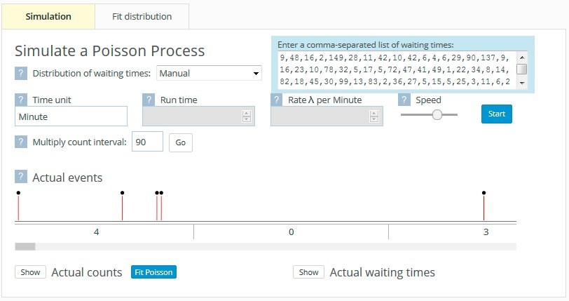
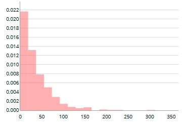
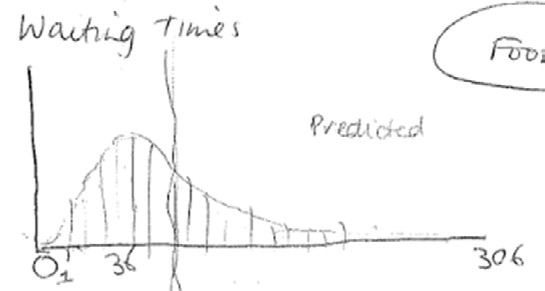
Time was taken to ensure that the students recognised where the numbers on the Actual events timeline came from. The first four waiting time values of 9, 48, 16, and 2 resulted in four goals being scored in one 90-minute period, giving rise to 4 in the first game. The fifth waiting time value of 149 meant that there were no goals scored in the next game, hence the 0 for the second game. Three goals were then scored in the third game. Having spent some time linking the waiting times to the counts, observing the goals being scored, and thinking about the context, the students were asked to imagine what the waiting time distribution would look like. Max’s conjectured distribution (see Figure 7(a)) is a typical example. The actual waiting time distribution is shown alongside in Figure 7(b).
| (a) | (b) |
|
|
 |
While Figure 6 illustrates inputting waiting time data, there is also the option of simulating constant waiting times or waiting times from several distributions, namely the exponential, uniform, triangular, and symmetric triangular distributions. Figure 8(a) shows the waiting times and corresponding goals simulated from a uniform distribution.
Figure 8 (a)
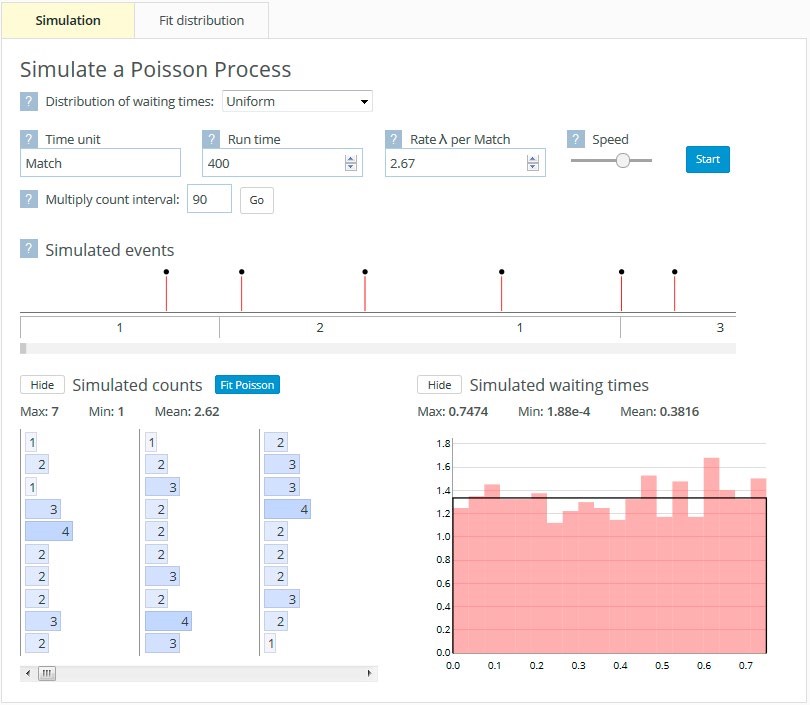
Figure 8 (b)
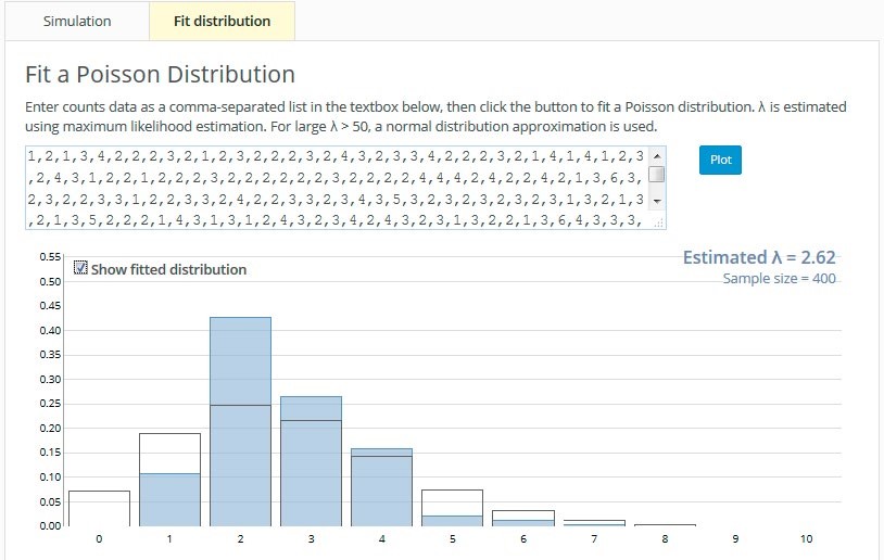
The students then simulated the waiting times between goals for these different distributions and in each case sketched their predictions of the distribution of the number of goals scored per game. They then switched to the Fit Distribution tab (see Figure 8(b)) to observe the distribution of the number of goals scored per game. Checking the Show fitted distribution box superimposes a Poisson distribution. Where waiting times have been simulated from a uniform distribution, a Poisson distribution does not fit the resulting number of goals scored per game distribution particularly well (see Figures 8(a) and 8(b)).
Conventionally, students learn about the Poisson distribution by being presented with the definition of a Poisson process and being given the formula for the probability function. They may also experience how the shape of the probability function changes for different values of the parameter λ. However, they do not experience directly the randomness underlying the Poisson process. Furthermore, the connection between the Poisson distribution and the exponential distribution is given a theoretical treatment which may not be obvious to all students. Preliminary findings suggest that the dynamic visualisations afforded by the Poisson tool develop in students an awareness and appreciation of randomness and distribution and of the underlying structure within the mathematical representations. In addition, the connection between the distribution of inter-event waiting times and the distribution of the event counts is made more transparent.
Limitations
The main limitation of this research study is the fact that it was conducted on a small group of students who had already completed an introductory course in probability. Ethics requirements meant that we could not recruit them before or during the course. Hence the participating students would already have had a mathematical understanding of many of the concepts addressed in the study. In the study, students interacted in pairs, with ample time devoted to understanding the processes they were observing. The utility of these tools in other settings such as large classrooms, and for students of varying ages and abilities, is therefore unknown.
Major implications
Our interviews with practitioners indicate that seeing structure and applying structure are important characteristics of probability modellers. These characteristics develop over time, leading to something akin to an intuition when faced with a new problem situation. To begin to build this intuition in students, we need to expose them to a diverse range of learning experiences in multiple contexts, and to implement teaching strategies that deliberately enhance transferability to new situations.
While the four software modelling tools developed in this study show promise in developing students’ probability modelling skills, our findings suggest that the some of the tools require further development. For example, because initial decoding of the eikosogram in two dimensions appeared difficult for students, we plan to first introduce students to a one-dimensional eikosogram. We also plan to modify the eikosogram to display both joint and conditional probabilities and to develop strategies designed to transition students from the visual representation of these probabilities to their mathematical representations. Preliminary analysis of student interaction with the pachinkogram suggests that we need to develop methods to transition students, both visually and cognitively, from the pachinkogram buckets to the actual probabilities represented in the linked eikosogram and probability graph. Similar to the suggested eikosogram modifications, we also need to develop ways of scaffolding students’ transition from the visual representation of probabilities to their mathematical representations. We also recognise the potential for the Poisson tool to be further augmented to include the ability to record and display previous simulations so that students can visually track the variation in distributional shape, an important idea related to one of the building blocks for probability thinking and modelling.
Although the tasks and tools developed in this study show promise, their implementation is not simple. Due to the exploratory nature of the study, we were able to give the students time to make and rationalise their conjectures prior to using the software tool which we believe was a necessary precursor for stimulating the desired thinking. For teaching purposes in a larger classroom setting, the cycle of conjecture, do, test, and analyse would need very careful consideration around the pedagogy about how to scaffold the students’ thinking and how to draw their attention to salient features of the visualisations.
As an exploratory study, where the participating students had already completed an introductory probability course and interacted with the tasks and tools in a semi-structured environment, the findings are tentative. It remains for a larger study, undertaken with students of varying abilities, and within typical classroom settings, to further investigate the utility of the dynamic visualisations described.
References
Bakker, A. (2004). Reasoning about shape as a pattern in variability. Statistics Education Research Journal, 3(2), 64–83.
Braun, V., & Clarke, V. (2006). Using thematic analysis in psychology. Qualitative research in Psychology, 3(2), 77–101.
Burns, R. B. (2000). Introduction to research methods (4th ed.). London: Sage Publications.
Chaput, B., Girard, J. C., & Henry, M. (2011). Frequentist approach: Modeling and simulation in statistics and probability teaching. In C. Batanero, G. Burrill, & C. Reading (Eds.), Teaching statistics in school mathematics – Challenges for teaching and teacher education. A joint ICMI/IASE study: The 18th ICMI study (pp. 85–95). New York, NY: Springer.
Chernoff, E. J., & Sriraman, B. (Eds.). (2014). Probabilistic thinking: Presenting plural perspectives. Dordrecht, The Netherlands: Springer.
Chu, S. (2003). Using soccer goals to motivate the Poisson process. INFORMS Transactions on Education, 3(2), 64–70.
Friel, S., Curcio, F. R., & Bright, G. (2001). Making sense of graphs: Critical factors influencing comprehension and instructional implications. Journal for Research in Mathematics Education, 3(2), 124–158.
Froelich, A. G., & Stephenson, W. R. (2013). Does eye color depend on gender? It might depend on who you ask. Journal of Statistics Education, 21(2), 1–11.
Garcia-Retamero, R., & Hoffrage, U. (2013). Visual representation of statistical information improves diagnostic inferences in doctors and patients. Social Science and Medicine, 83, 27–33.
Garfield, J., delMas, R., & Zieffler, A. (2012). Developing statistical modelers and thinkers in an introductory, tertiary-level statistics course. ZDM – International Journal on Mathematics Education, 44(7), 883–898. doi: 10.1007/s11858-012-0447-5.
Gigerenzer, G. (2002). Calculated risks: How to know when numbers deceive you. New York, NY: Simon & Schuster.
Gigerenzer, G. (2014). Risk savvy: How to make good decisions. New York, NY: Viking.
Gigerenzer, G., & Hoffrage, U. (1995). How to improve Bayesian reasoning without instruction: Frequency formats. Psychological Bulletin, 102, 684–704.
Graham, A., Pfannkuch, M., & Thomas, M. O. (2009). Versatile thinking and the learning of statistical concepts. ZDM – International Journal on Mathematics Education, 41(5), 681–695.
Greer, B., & Mukhopadhyay, S. (2005). Teaching and learning the mathematization of uncertainty: Historical, cultural, social and political contexts. In G. A. Jones (Ed.), Exploring probability in school: Challenges for teaching and learning (pp. 297–324). New York, NY: Kluwer/Springer Academic Publishers.
Kahneman, D. (2011). Thinking, fast and slow. New York, NY: Allen Lane.
Koehler, J. J. (1996). The base rate fallacy reconsidered: descriptive, normative and methodological challenges. Behavioral and Brain Sciences, 19, 1–17.
Konold, C., & Kazak, S. (2008). Reconnecting data and chance. Technology Innovations in Statistics Education, 2(1). Retrieved from http:// escholarship.org/uc/item/38p7c94v
Makar, K., & Confrey, J. (2005). “Variation-Talk”: Articulating meaning in statistics. Statistics Education Research Journal, 4(1), 27–54.
Molnar, R. A. (2008). Bus arrivals and bunching. Journal of Statistics Education, 16(2).
Moore, D. (1997). Probability and statistics in the core curriculum. In J. Dossey (Ed.), Confronting the core curriculum (pp. 93–98). Washington DC: Mathematical Association of America.
Navarette, G., Correia, R., & Froimovitch, D. (2014). Communicating risk in prenatal screening: The consequences of Bayesian misapprehension. Frontiers in Psychology, 5(1271), 1–4.
Nickerson, R. (2004). Cognition and chance. Mahwah, NJ: Lawrence Erlbaum Associates.
NVivo (version 10) [Qualitative data analysis software]. (2012). QSR International Pty Ltd.
Oldford, R. W., & Cherry, W. H. (2006). Picturing probability: The poverty of Venn diagrams, the richness of eikosograms. Retrieved from http://www.stats.uwaterloo.ca/~rwoldfor/papers/venn/eikosograms/paperpdf.pdf
Pfannkuch, M., & Budgett, S. (in press–a). Markov Processes: Exploring the use of dynamic visualizations to enhance student understanding. Journal of Statistics Education.
Pfannkuch, M., & Budgett, S. (in press–b). Reasoning from an eikosogram: An exploratory study. International Journal of Research in Undergraduate Mathematics Education.
Pfannkuch, M., Budgett, S., Fewster, R., Fitch, M., Pattenwise, S., Wild, C., Ziedins, I. (in press). Probability modelling and thinking: What can we learn from practice? Statistics Education Research Journal.
Pfannkuch, M., Budgett, S., & Thomas, M. J. (2014). Constructing statistical concepts through bootstrap simulations: A case study. In U. Sproesser, S. Wessolowski, & C. Worn (Eds.), Daten, Zufall und der Rest der Welt – Didaktische Perspektiven zur anwendungsbezogenen Mathematik (pp. 191–203). Berlin, Germany: Springer-Verlag.
Pfannkuch, M., & Ziedins, I. (2014). A modelling perspective on probability. In E. J. Chernoff, & B. Sriraman (Eds.), Probabilistic thinking: Presenting plural perspectives (pp. 101–116). New York: Springer.
Sacristan, A., Calder, N., Rojano, T., Santos-Trigo, M., Friedlander, A., & Meissner, H. (2010). The influence and shaping of digital technologies on the learning –and learning trajectories – of mathematical concepts. In C. Hoyles, & J. Lagrange (Eds.), Mathematics education and technology—Rethinking the terrain: The 17th ICMI Study (pp. 179–226). New York, NY: Springer.
Schoenfeld, A. (2007). Method. In F. Lester (Ed.), Second handbook of research on the teaching and learning of mathematics (Vol. 1, pp. 96–107). Charlotte, NC: Information Age Publishers.
Shaughnessy, M. (2007). Research on statistics learning and reasoning. In F. Lester (Ed.), Second handbook of research on the teaching and learning of mathematics (Vol. 2, pp. 957–1009). Charlotte, NC: Information Age Publishers.
Thomas, M. O. (2008). Conceptual representations and versatile mathematical thinking. In Proceedings of the Tenth International Congress in Mathematics Education, (pp. 1–18). Copenhagen, Denmark. Retrieved from http://www.icme10.dk/proceedings/pages/ regular_pdf/RL_Mike_Thomas.pdf.
Villejoubert, G., & Mandel, D. R. (2002). The inverse fallacy: An account of deviations from Bayes theorem and the additivity principle. Memory & Cognition, 30, 171–178.
Watson, J., & Callingham, R. (2014). Two-way tables: Issues at the heart of statistics and probability for students and teachers. Mathematical Thinking and Learning, 16, 254–284.
Wild, C. J., & Pfannkuch, M. (1999). Statistical thinking in empirical enquiry (with discussion). International Statistical Review, 67(3), 223–265.